- My role
- Design direction & system design
- Project
- Self-initiated design system
- Made with
- Figma & AI-assisted iteration
- Release
- Studio UI 2.2
01 / The challenge
A useful system can have a little attitude.
I wanted a reusable interface library that felt expressive enough for creative studios, with the structure needed for everyday product work. The challenge was to make bold colour, typography and illustration work alongside clear controls and predictable states.
I directed the visual choices and iterations, using AI to help construct native Figma components and run checks. This is a self-initiated project: the examples demonstrate the system, with product research and adoption testing still to come.
02 / The system
One visual language.
Plenty of room to play.
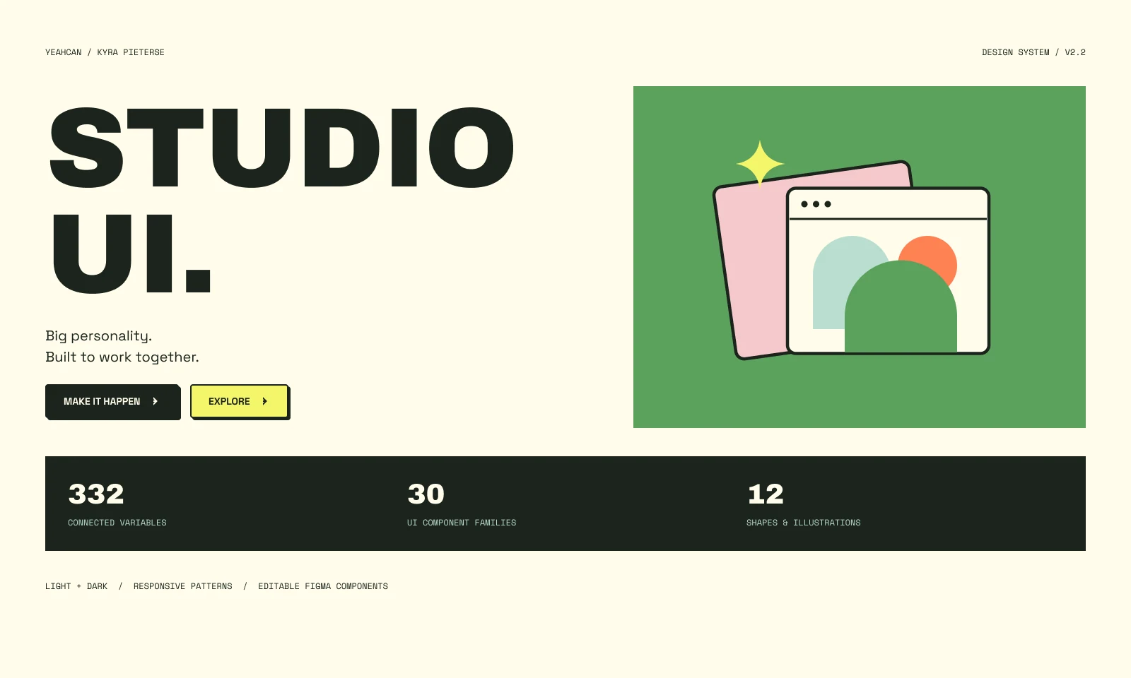
- connected variables
- 332
- component families
- 30
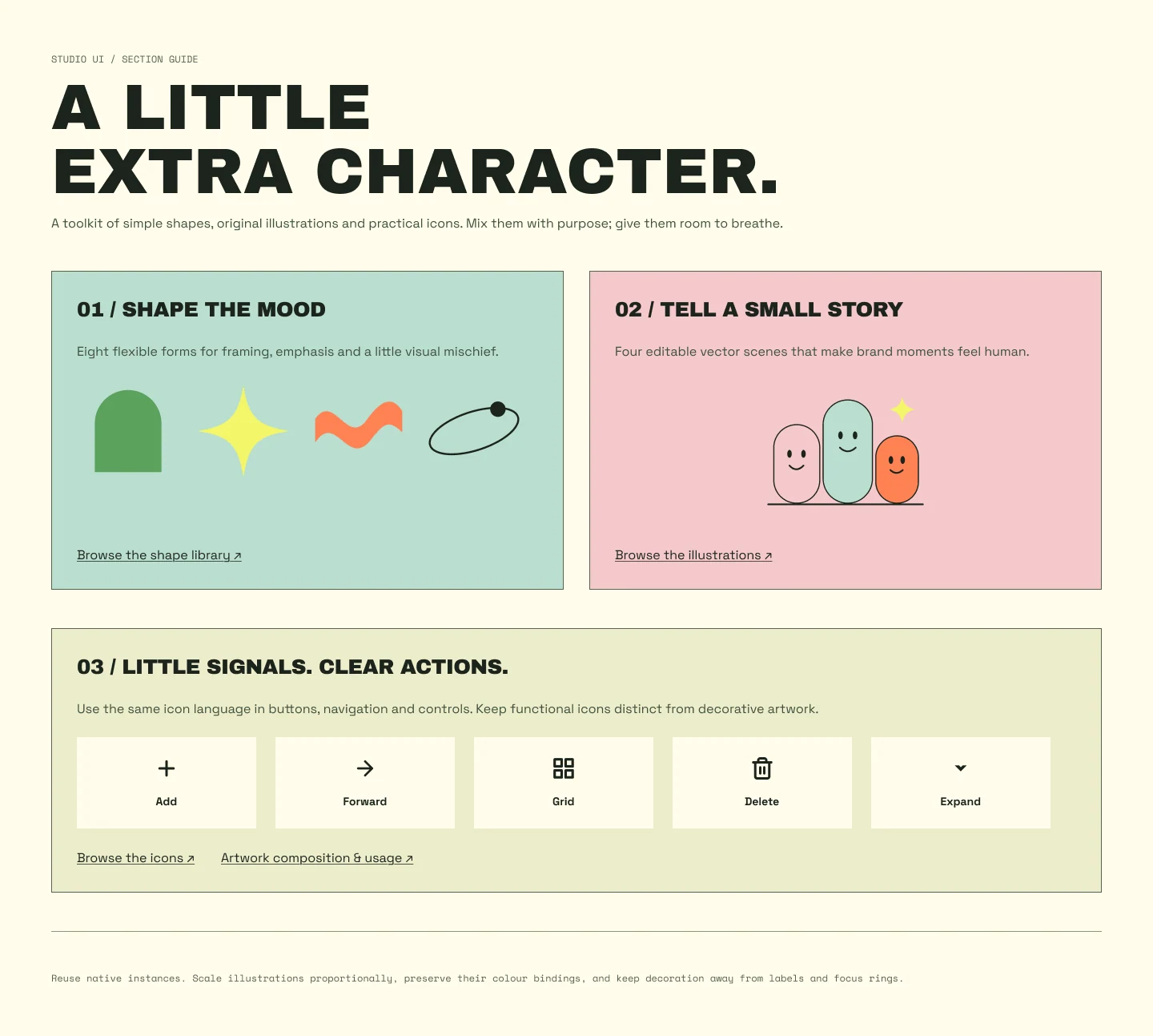
- shapes & illustrations
- 12
- colour modes
- 2
Personality, with a shared foundation.
Cream and ink give the interface a calm base. Grass, butter, mint, orange and pink bring energy to selected moments. Semantic colour roles keep those choices consistent when the theme changes.
Build once. Adapt through properties.
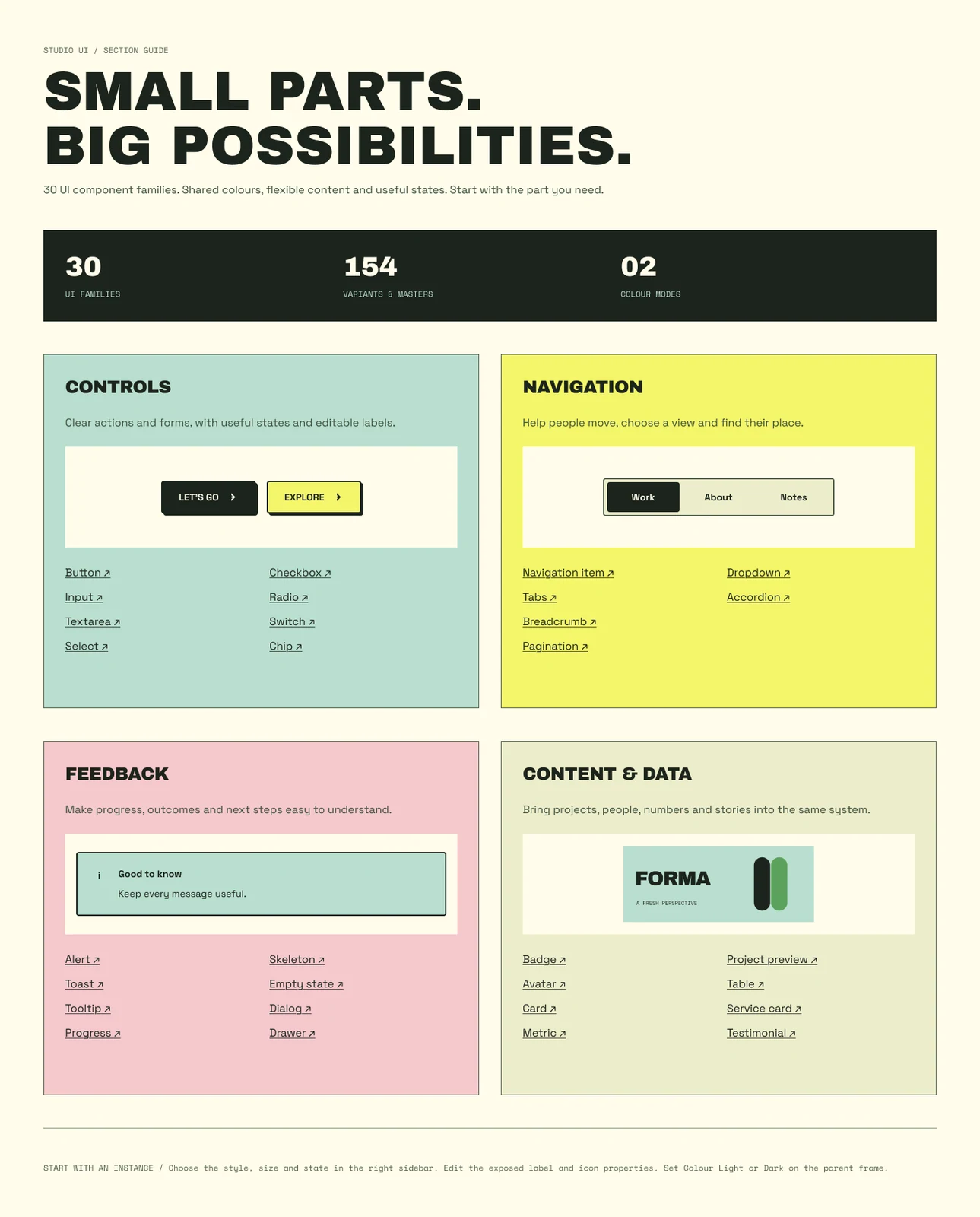
Buttons expose labels, size, state and swappable icons. The same approach carries through forms, feedback and content components, so a new screen starts with connected parts.
Make the library easy to find your way around.
Foundations, Assets, Components, Patterns and Resources each have a populated overview. Native previews and direct links turn the file into a working reference.
03 / The refinements
The details that make it work.
A design review surfaced three concrete improvements. Each became a scoped change with a recorded check.
01 / Review → revision
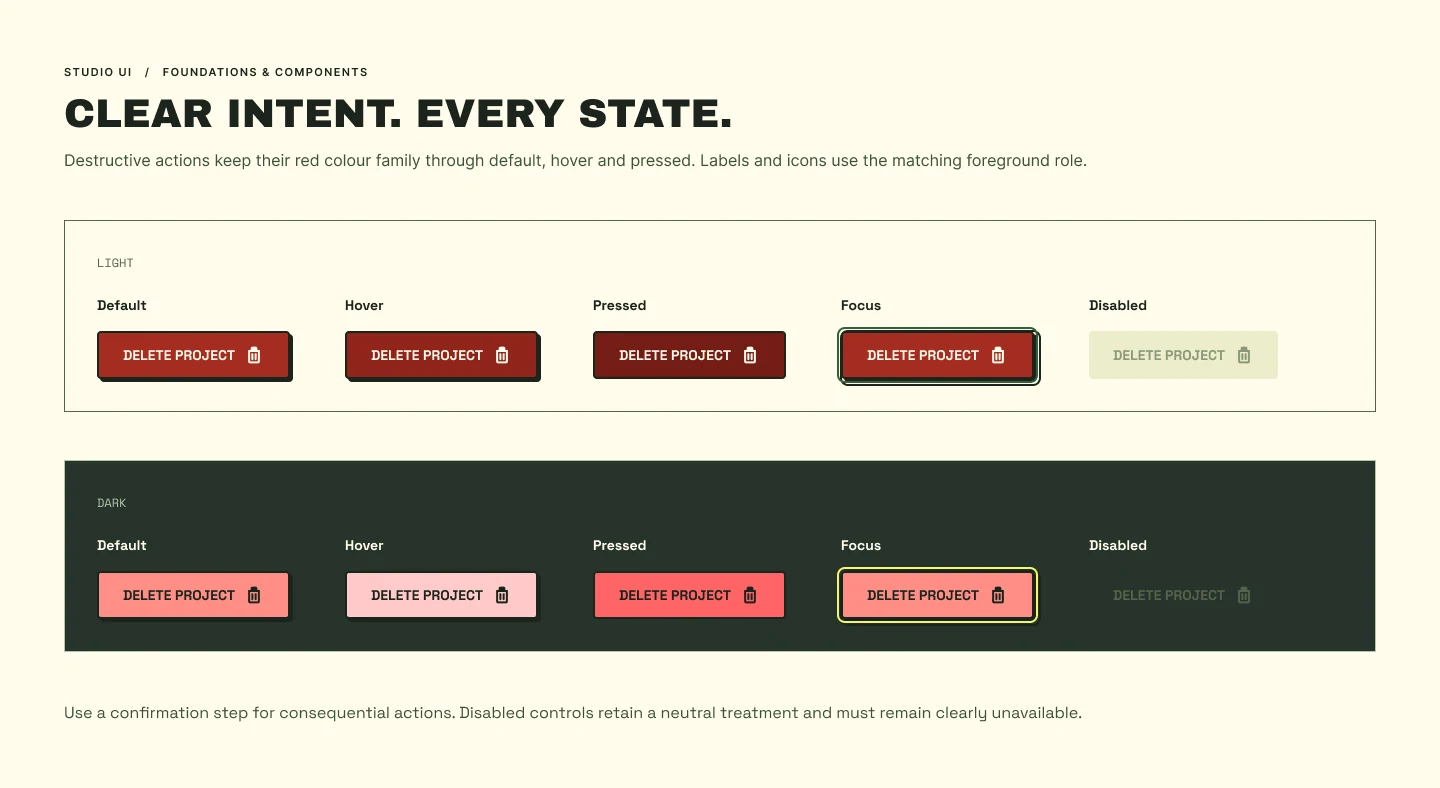
Keep destructive actions recognisable.
- Before
- In Light mode, the button changed from red to black on hover and green when pressed.
- After
- Default, hover and pressed now stay within a red family. Foreground and focus treatments are checked in both modes.
Token and component-state checks; no usability result is claimed.
02 / Review → revision
Give typography one clear naming system.
- Before
- Active text styles were split across Funky, Studio and earlier naming groups.
- After
- Active styles now live under Studio. Older styles are marked Legacy / Deprecated, with their IDs preserved for existing layouts.
A recorded migration map and style-reference checks.
03 / Review → revision
Put today's work first on mobile.
- Before
- Tasks and reviews sat below a large welcome panel and three project cards.
- After
- Tasks and reviews now come directly after navigation, in both Light and Dark mobile layouts.
A verified hierarchy change. Whether it helps people act faster still needs participant testing.
A clearer mobile hierarchy
Start with what needs attention.
The first screenful now leads with today's tasks. The expressive welcome panel and project cards remain further down the page.
These are crops of the actual before and after Figma layouts.


04 / In context
From parts
to whole pages.
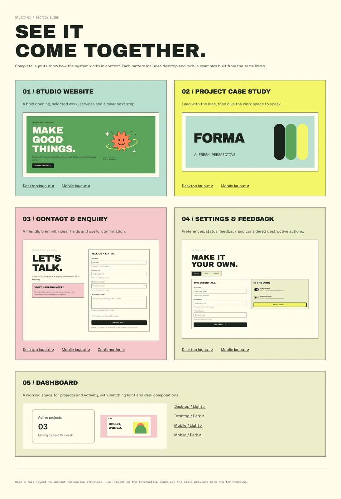
Studio websites, case studies, enquiry forms, settings and dashboards demonstrate how the library combines into responsive layouts.
Examples include empty and loading states, feedback, selection and confirmation. They are design prototypes; production data, form handling and keyboard behaviour need implementation.
05 / The outcome
A working toolkit.
An ongoing practice.
What is delivered
An editable Figma library with 30 component families, two colour modes, original brand artwork, responsive examples and usage guidance. The release includes automated checks for token mappings, component states, links and layout bounds, supported by visual review.
What comes next
Ask other designers to build a screen with the library and test the task-first dashboard with intended users. Those studies can reveal real friction and guide the next release. Adoption, task-completion and business-impact results are not yet measured.
Created by Kyra Pieterse / YeahCan. Interface icon helpers use Figma's Simple Design System. CreateUI informed the initial library structure; JUICE inspired the expressive colour and scale. Studio illustrations and layouts were created for this project.