- My role
- Product direction & interaction design
- Focus
- Clear choices & transparent costs
- Deliverables
- Figma prototype & interactive HTML
- Approach
- AI-assisted design & development
Designed for desktop & mobile
The same clarity. Any screen.
Compare side by side on desktop, or work through each choice on your phone.
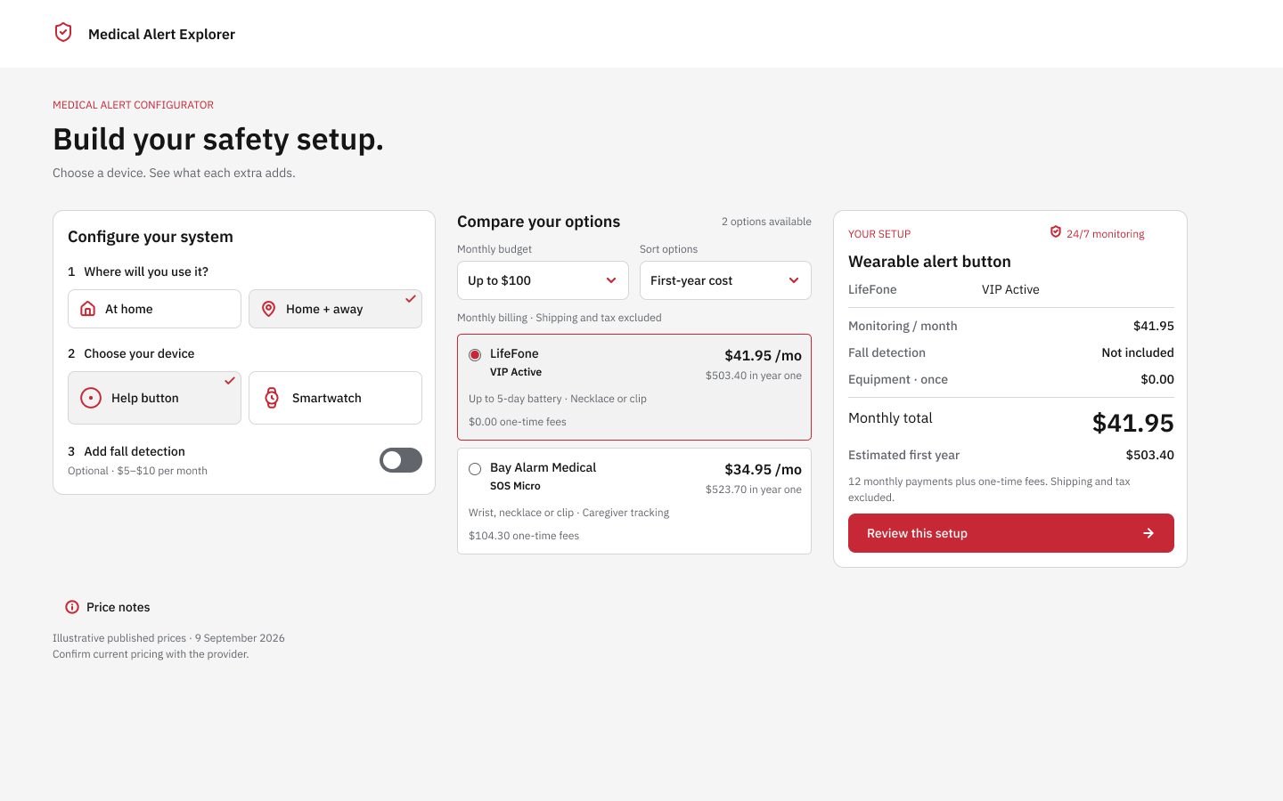
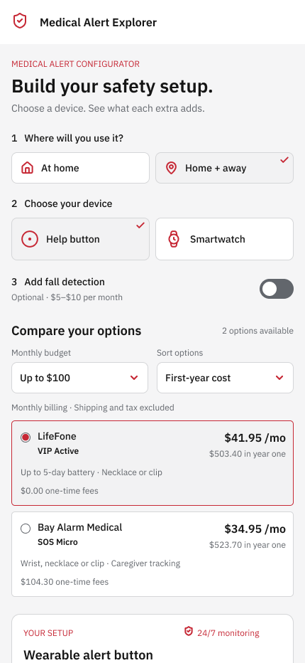
Screens exported from the Figma prototype. Select a mockup to try that version.
01 / Try it
A clearer way to compare.
Choose a device, add fall detection and see how the monthly and first-year costs change.
Working concept with illustrative pricing from 9 September 2026. No personal details, checkout or live provider data are collected.
Try it on mobile
The mobile experience.
Right here.
Tap through the choices and scroll inside the phone to compare providers and review your setup.
Try changing the device, adding fall detection or adjusting your monthly budget.
Compare with the mobile Figma prototype ↗02 / The challenge
Make the trade-offs visible.
A lower monthly price can hide a higher first-year cost. Device types, equipment fees and optional fall detection make a simple comparison harder than it needs to be.
This concept redesign brings those decisions into one place. A familiar sequence guides the setup, while the comparison and itemised summary show the effect of every choice.
Keep the choices connected
Coverage determines the available devices. Budget filters the offers. A valid selection stays selected when the sorting changes.
Show the full estimate
Monthly monitoring, optional extras and one-time equipment costs remain visible. First-year sorting gives those setup fees a place in the comparison.
Design for two screen sizes
Desktop places setup, offers and totals side by side. On mobile, the same decisions become a compact, readable sequence.
03 / From design to interaction
Two ways to explore the same idea.
The Figma prototype uses reusable provider cards, shared colour variables and prepared interaction states. Refinement focused on restoring useful icons, reducing the work behind each click and establishing a medical red, white and grey visual system.
The HTML version translates those decisions into native browser controls, keyboard navigation and responsive layouts. Both versions use the same example products and pricing rules.
04 / What this demonstrates
A prototype you can put through its paces.
Try an empty budget, change devices or compare monthly and first-year rankings. Automated checks cover the pricing rules and state changes, supported by desktop and mobile browser checks. This is a portfolio concept; usability and business outcomes have not been measured.
Design direction by Kyra Pieterse / YeahCan. Concept adapted from an existing medical-alert configurator. Product names belong to their respective providers. Icons: Lucide. Typeface: IBM Plex Sans. Asset licences.