- Project
- Self-initiated concept
- Focus
- Product & interaction design
- Deliverables
- Editable Figma + responsive HTML
The design goal
Make the next delivery feel predictable.
A subscription asks people to commit to a future cost. For someone building a coffee routine, bag count, delivery frequency and optional treats need to be easy to compare without hiding what will repeat.
For whom?
Coffee drinkers choosing a flexible home delivery.
What should feel easier?
Make the first delivery and every following delivery understandable before any commitment.
Compare without losing your place
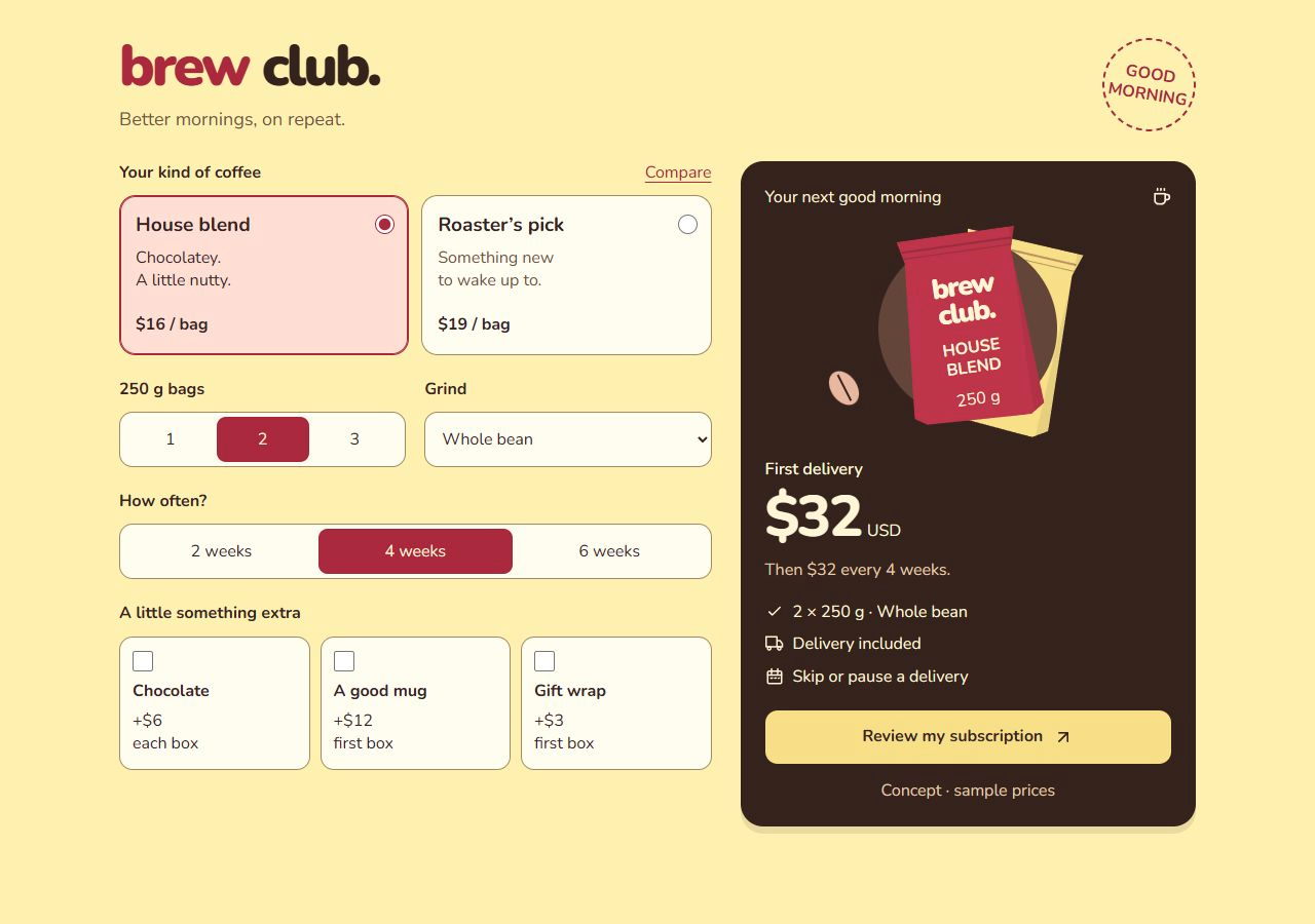
Two coffee cards sit beside the summary. The comparison expands in the same flow, so tasting notes and price differences stay close to the decision.
Show what changes
Bag count changes the packaging preview and delivery charge. Grind and frequency remain explicit selections. Colour, borders and checked controls reinforce the current configuration.
Separate now from next time
Chocolate repeats with each box; the mug and gift wrap do not. The summary separates the first total from the following-delivery cost, and the review itemises the difference.
A price you can check
Two House blend bags start at $32. Add chocolate, a mug and gift wrap: the first delivery becomes $53, followed by $38 every four weeks. One bag adds $4 delivery; two or more include it.
All prices are illustrative USD. This concept does not place orders, start subscriptions or collect payment details.
The same choices,
with room to breathe.
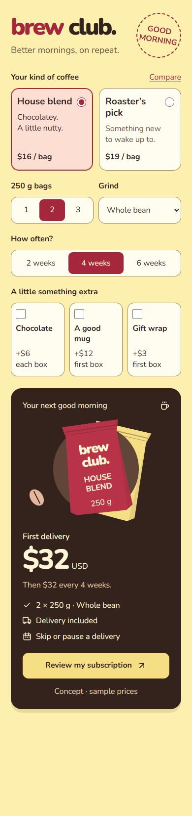
On narrow screens, the controls and summary stack in normal page flow. The summary never covers a choice. Text stays at least 16px, with labelled inputs, visible keyboard focus and price changes announced to assistive technology.
Native radio buttons, checkboxes and a labelled select keep the controls familiar. Selected states use text, checked controls and borders as well as colour. Reduced-motion preferences disable decorative transitions.
What I would test next
Can people correctly explain their first and following charges? Do they notice when delivery becomes included? I would observe a first-time user comparing coffees, changing frequency and removing an extra, then ask them to predict the next bill.
HTML demo
Make a few choices.
Compare the options, change the configuration, then review the breakdown. Your choices remain when you return to edit.
Figma prototype
Explore the decisions behind it.
Foundations, reusable controls, and desktop and mobile flows. Change options independently, compare choices, and review the updated total in Figma or the HTML prototype.