- Project
- Self-initiated concept
- Focus
- Product & interaction design
- Deliverables
- Editable Figma + responsive HTML
The design goal
Build a team kit. Understand the trade-offs.
Someone putting together merchandise for a team needs to balance what each person receives against the overall budget. Quantity discounts and optional extras can make that comparison unnecessarily difficult.
For whom?
Small-team organisers planning welcome kits or an event drop.
What should feel easier?
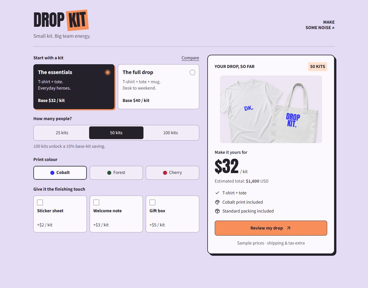
Keep product, quantity, print colour and cost connected in one compact decision space.
Keep the products recognisable
White T-shirts, totes and mugs provide a consistent canvas. Changing the print colour alters the artwork; choosing the full kit introduces the mug without changing the product photography.
Make the discount explain itself
At 100 kits the base price receives a 10% reduction. Extras keep their normal unit prices. The saving appears as a separate line in review rather than an unexplained lower total.
Connect one kit to the whole order
Per-kit price and overall total appear together. Selected controls, the product preview and the quantity label respond immediately, while shipping and tax remain clearly additional.
A price you can check
50 essentials kits start at $32 each: $1,600. At 100 full kits, the $40 base drops to $36. All three extras add $10 per kit, making $46 each and $4,600 before shipping and tax.
All prices are illustrative USD. This concept does not place orders, start subscriptions or collect payment details.
The same choices,
with room to breathe.
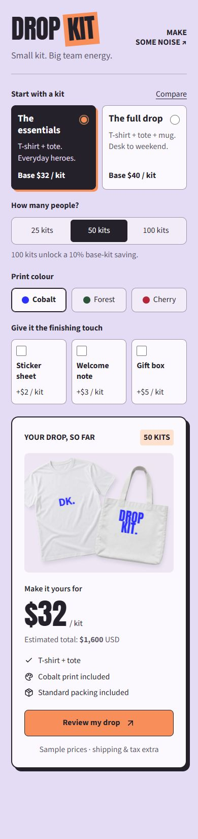
On narrow screens, the controls and summary stack in normal page flow. The summary never covers a choice. Text stays at least 16px, with labelled inputs, visible keyboard focus and price changes announced to assistive technology.
Native radio buttons, checkboxes and labelled toggle buttons keep the controls familiar. Selected states use text, checked controls and borders as well as colour. Reduced-motion preferences disable decorative transitions.
What I would test next
Do organisers distinguish the base-kit saving from extra costs? Can they compare 50 and 100 kits without losing their configuration? I would also test whether the changing artwork and added mug provide enough feedback without relying on colour alone.
HTML demo
Make a few choices.
Compare the options, change the configuration, then review the breakdown. Your choices remain when you return to edit.
Figma prototype
Explore the decisions behind it.
Foundations, reusable controls, and desktop and mobile flows. Change options independently, compare choices, and review the updated total in Figma or the HTML prototype.