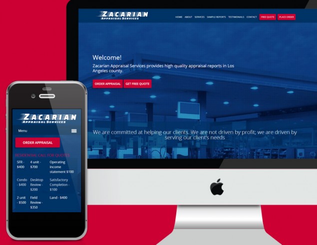
Zacarian Appraisal Services new website
One more property appraisal site going mobile friendly
It’s great when one good job leads to another good job. In this case it certainly worked like that. Team Yeah Can had hardly completed the Home Appraisals site, adding the Commercial one to the fold, and a new client from the other side of the United States operating in the very same environment approached the team for a new site.
This time the brief was completely different. The Home Appraisal site is a full on ecommerce site where visitors are encouraged to get a quote and pay online. In the case of Zacarian Appraisal Services the client wanted more of a public relations effort rather than a full on sales focused site.
Wonderful images make all the difference
And he gave us fabulous images. What a difference it makes when the team can work with high quality, copy right approved images. It lifts a website. It’s something that clients tend to want to save on, buying good quality photographs. Regrettably.
The web is a visual medium. People react well to images and allow themselves to be influenced by great images. How do you feel at a spectacular sunset? Most people feel awe and wonder. In the same way other images can influence our thinking in different ways. So why not use really good images on your website to persuade visitors that your product and service is worth having.
Sliding site
Sliding sites are starting to get fashionable. And this site certainly lent itself to this format. It’s a newish trend to make a website scroll down rather than asking visitors to hop from menu item to menu item where each page is the size of the monitor.
Gone are the days where scrolling was out and ‘below the fold’ was something to be avoided at all cost. Perhaps the fact that websites are now viewed on small screens could have something to do with the fact that people are slowly letting go of this very ‘print’ focused concept.
Below the fold
Most people won’t even know what below the fold means. It was the term used by the newspaper industry. Newspapers were sold folded over and presented by newspaper sellers with the top half of the newspaper visible. This is where the big headline and image hat to be to persuade people to hand over money for a paper.
A print term hardly has a place in web terminology surely. After all we don’t fold over a website to wave it around on the street corner. In fact what the mobile web has done for us is finally weaned us off print. We don’t read websites anymore like we did with print brochures i.e. one page after the next.
Mobile friendly works differently
What the mobile friendly web has done is force us to scroll. Yes. Past the fold. Always. If we were to stick to the fold when dealing with websites that are viewed on smartphones, and won’t they all soon.. nobody would get to see more than one image and read one paragraph. There is no end to how far we can scroll. There is no longer a fold.
Have a look at Zacarian Appraisal Services brand new website and see what the web has done to how we handle websites. This is where the trend is going to be heading towards. Be open to this new way of dealing with information. And get used to it. For the short term this is how websites will be viewed. Can’t say what will happen in the future of course. The web has changed so much already. Anything is possible. Yeah.


